Showing posts with label mustard. Show all posts

Tuesday, March 20, 2012

Inspired Interiors: Blue Honey

mustard gray and white mantle via annesage

I'm not quite feeling the spring yet. I love the varying shades of blues here, like a range of patina... but the hints of  honey and mustard accents keeps me in my comfort zone. I've been having a lot of decorating ideas lately that combine these colors, even with a bit of navy mixed in. I just got a new set of chairs from a city wide garage sale and am considering finally pulling out that sander I borrowed from my friend to do something colorful. Well see where this adventure takes us.
kids  room via living,etc

mustard wallpaper and blue chair via annesage

aqua bedroom design via madeline stuart

Wednesday, May 18, 2011

Personal Style: Vested To the Fair

I love this shirt b/c it reminds me of Guenevere's mustard major cowl/boat necked dress in Camelot during The Take me To the Fair scene with Sir Lionel. (nerd, I know.) I went out on a limb and paired it with this baggy charcoal jersey-ish vest. Maybe it's not that cute, but I like it, so there. I think I'm going to take the vest in and make it a tad tighter.

I got this bag for free at a clothing swap. Have you ever been to one? Hosted one?

 I did Jo's messy low side ponytail (tutorial)... only mine didn't turn out as messy. sadface.


 I blinked in almost every photo. This is the best I've got.
 
Going to the gym has been great for my abs and finally losing the baby weight. As for my a*s.. not so much, It's shrinking! That's not a good thing in my book. I guess I'll have to workout then go home and gorge on some brownies or something.

Tuesday, June 29, 2010

Inspired Room: Designing with Mustard and Chartreuse

I love the combination of everything here. It seems like too much mustard, but the soft floral pillows in the pinks, the roses, the pale blue throw and those industrial light fixtures make it all work. Not to mention the lovely rug, wow. The picture frames matching the legs on the sofa and the dark wood floors add balance through color. Artful Arranging


I may not have revealed this before, but mustard and chartreuse are two of my favorite decorating colors. Decor8 had blogger and Color Consultant Rachel Perls write a little about decorating with these colors here.

I believe this room is simply perfection.  Mustard looks great with so many colors, but if you want it to pop, keeping it in clean lines and paired with black and white geometric prints seems to be a crisp, and popular choice. One thing I love about decorating in neutrals, is adding and removing colors on a whim is so easy. Living etc.

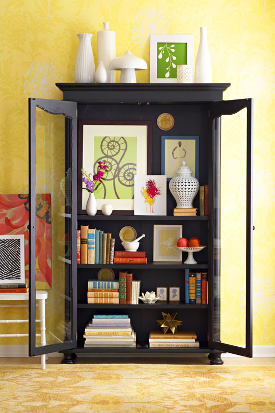
 "Designers Jean Norman and Meredith Ladik love peeks of art or photography on bookshelves, atop mantels, inside display armoires, or in unexpected spots, such as leaning against a chair back."Artful Arranging 

Even adding these colors to an outdoor space can really brighten up a dreary patio that doesn't boast much color or have a lot of flower garden elements.

A mustard chair, white plank floors and gray polka dot walls with a wallpaper flanking a white mantle, industrial pendant lamps, and aqua vintage duck caddy and a lovely table filled with books. A bear statue with a horse and cowboy photo on the mantle... every element is gorgeous. House to Home via decor8

The chartreuse pillows mixed with aqua and a touch of pink is an interesting mix, but it works. I love the polka dots mixed in here with the geometric pattern on the rug. House Beautiful via Home Designing.

Same with chartreuse and the geometric prints. I love how they went with linen and chocolate instead of black and white to keep the crispness, without being too harsh. ~ Taylor Howes

I never would have thought I would have like the red comforter just laying on top of the blue blanket before... but I love it! And that bedside table, beautiful. The mustard comes in the form of design in the headboard, the upholstered chair and golden tones on the frames. Living etc.


"Very small pieces of art can sometimes drown in big expanses of bare walls. Instead, seek out cozy spots to tuck these tiny treasures. Try the back of a bookshelf, an oddly shaped corner, or minuscule stretch of wall in a small bathroom or kitchen" ~ Artful Arranging

For those who love color, adding small doses in a variety keeps a comfortable feeling without being married to a specific color and  design concept. This is a good way to add in new colors, that one would typically find too bold or shy away from.

I love the simplicity here. Usually the small photo over the bed would annoy me, but because the room is s basic, but with a clear design and minimal color concept, I am quite fond of that little sock monkey.  the 10 cent designer via sfgirlbybay.

I can imagine, that this wall color changes throughout the course of the day when the sun shines through the home, then again when it withdraws. I love the natural wood and white with the mustard walls. Aren't those pendant lights amazing? Joe Nahem via Elle Decor.
Gray, now I'm in heaven. A blast of mustard yellow in the art and the flowers are gorgeous. But the pairing with the gray sofa is my favorite. Elle Decor design by Nate Berkus

This is the same sofa design as the first photo, but without the industrial lights and new pictures, and the chartreuse and mustard remain on the lower half of the room only. Creating a little gallery wall like this is easy... directions here and the peonie download here. Artful Arranging

If you are still not sold on these colors, and you don't want to go out a buy a new knick-knack, pillow or can of paint to introduce it to your room... then settle with a bouquet of flowers to see how it brightens your area.

Saturday, September 5, 2009

The Influence of Color


Today's color combination is quite, obviously, turquoise and hues of yellow.  I had a discussion with a friend years ago, about using colors as verbs in our writing. Aside from "feeling blue" as a form of sadness, I couldn't really justify using color as a verb, or even a noun.

Then, he wrote a lovely prose that ended with something along the lines of, "he reached out to the sky, and he could feel blue." It made perfect sense and changed my mind about the use of color as more than just imagery, but as a way we wrap ourselves up in something greater then needing to name or objectify it outright.


shana rae {florabella}~ yellow ranunculas blooms 

My husband once pointed out to me, that when ever we go shopping, I always pick up something that perfectly coordinates with my current outfit. If I am wearing my muted orange sweater, everything will be orange or caramels. If I am wearing a pale pink blouse, then all I pick up will be pinks.

I found that interesting how I was magnetized to the same color I had been attracted to in the mornings. How, I can look perfectly fine in one thing, but change it because the color isn't suiting me that day and makes me feel "too bright" "too down"...
 
jeweled ambrosia ~ turquoise, mustard rhinestone earrings

It is amazing to realize how deeply influencing color can be. If you could feel a color today, what would it be?

Related Posts with Thumbnails