I am currently undertaking two new adventures that I am oh, so happy about.
The first, is my new family blog. As Little Lovables expands, it's time to create a distinct space for me to gather my mommyhood rants and relishes, family adventures, and such. It's called, Oh, Those Aarons! and I hope you come by to visit.
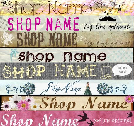
My second adventure, concerns Etsy (of course). I have been playing around for a while with graphic design and have been having so much fun with it! I still have a lot to learn, but with my new Little Lovables shop graphics kits, I am offering them at very low prices for people just starting out, but who still wants to get something a little bit funky and glamorous! What do you think of them? What themes/colors are you looking for in a banner?

As a seller mentor, one thing I always think of when I first come across a shop is their banner. I have heard it said, that if a seller can't put up a clean looking presentable banner, than their products/customer service can't be that great. Now, I know this isn't true for many of us, but I can see how a first impression of the shop is determined by the first thing the {potential} customer sees, your banner and avatar.
I will also compile a huge mentor list of advice soon, so if you have any questions (don't be afraid to ask, I've probably already heard it!) then let me know and I will try and address each one.


9 comments:
Ive been working slowly but surely trying to put an etsy shop together. My daughter is working on my banner. I do wish she would hurry up and finish it!!!
I may have questions for you later!
hugs
vivian
Thanks for dropping by my blog!
You have an adorable blog here...wonderful color!
Lenae
Thanks for your kind comments on my blog today! Love your blog. :)
~Jenifer
thanks for finding me...now I have found your lovely blog and am an excited follower....I adore your graphics...I would so like to learn how to do that and what I need to buy for my computer to have fun stuff happening on my blog...I really know nothing...any suggestions on a good graphic software? I am so excited to read some of your past posts...so off I go! Happy week to you!
i love your headers! good luck on your new venture! xo
ahhhhh...thank you soooo much...I will give it a try...I have to start somewhere right? If I learned how to do this blog stuff I should be able to do some graphics...right? I so appreciate you! xoxo
I totally agree, I love a sharp looking banner, it just says fabulous.
I have stumbled upon your blog by chance, and am so happy I did! What a great blog!
Those banners look great, and I agree with you about the first impression issue. A banner that doesn't look right to me, will scare me away from a shop, I must admit!
Nice to meet you, I'll be back and I will follow ;)
Tali
this blog is lovely. I'm totally with you on the banners-- it could be the graphic designer in me but stretched type makes me want to run for it ;) like your creations-- especially the fourth one down-- very simple with a touch of quirky.
Post a Comment